Gunner
Blossom, day 4
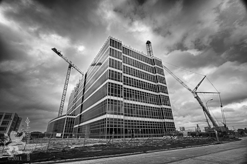
Silver blur
The club got an influx of new members 2-3 years ago and many of them were relatively new to photography. They were eager to experiment and learn. As perhaps a byproduct of the digital-age instant gratification mindset, they also wanted to jump right in and participate in the program without taking the time to learn the nuances of our system. I can't say I blame them; I did the same thing when I first joined. However, I didn't ring the alarm bells and call the system flawed when the judges didn't "get" my approaches. I just tried harder. It ended up making me a better photographer.
At the behest of a vocal minority, the powers that be decided to attach rather specific and limiting narrative descriptions to the topics so the newer members would have a better feel for what the judges would look for. Their intentions were good, but the result was that the range of creativity in the entries dropped considerably and the entries became mostly rote and predictable. I've seen a wider creative range in the last few months but I still think the narratives are too limiting. Besides, the people who complained the loudest don't even participate anymore. So, I decided to make a point. My interpretation of "whatever the photographer wants to do to create areas that are not in focus in the composition" was to turn in a photo that was entirely sharp and in focus. I got a Silver award for my entry. It shouldn't be too difficult to see where the element of "blur" comes in, and thankfully the judges didn't

Blossom, day 2

Random trivia: there are two 12½-ton (25,000 lbs.) weights and one 7-ton (14,000 lbs.) weight on the back of this crane. That's 64,000 pounds of counterweight in addition to the weight of the crane itself which I'm sure is well over 100,000 pounds. «Liebherr» is a common German surname which translates into English as "dear gentleman."
Blossom, day 1

Revisiting a forgotten friend


I thought the image needed more bite to convey the real sadness of the scene, so I used Silver Efex to make a rougher, more contrasty rendering and gave it a very subtle cool tint. I had to use a Lightroom gradient adjustment to bring back a little of the background detail so the image wouldn't lose its sense of place.
I'm curious to get feedback on this new version. Better? Worse? Why? Any suggestions for additional improvements?
Push to Open
The Random House Dictionary® defines low key this way: "(of a photograph) having chiefly dark tones, usually with little tonal contrast." The Collins English Dictionary defines low key as "having a predominance of dark grey tones or dark colours with few highlights." Perhaps my favorite explanation, which is too long to quote here, comes from Encyclopædia Britannica. The point is, nobody really seems to know for sure exactly what low key is. It is one of those "I know it when I see it" subjects that defies succinct and concrete definition.
So, with that very long lead-in out of the way, I must say that I was surprised at what the photo club judges considered "good" low key photographs. Not that I disagreed with them, I was just surprised. My entry for the category, shown below, won a Silver Award and tied for high score of the night.
I'm not sure my photo neatly fits any of the definitions I found. The glut of definitions and their conflicting natures once again highlights the very subjective nature of art. Nevertheless, I knew it when I saw it and I'm glad I decided to shoot it.
A Case for iPhone HDR
One of the problems with the iPhone camera is that the colors are often flat. I suppose color rendering ability is one of the areas in which designers have to compromise to cram a several megapixel sensor and optics into the space available in a cell phone. Phone cameras also are often used in less-than-ideal lighting situations. The question arises, then, what to do to compensate for poor rendering. Quite by accident, I discovered that TrueHDR may be one of the answers to that question.
I took the following two photos using TrueHDR's integrated picture-taking feature. One is exposed for the highlights and the other for the shadows. On their own, neither is remarkable (nor is the photo I took with the built-in Camera app).
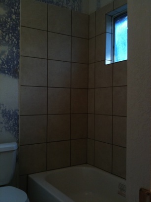
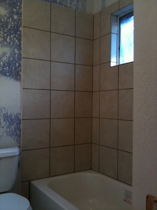
The exposures are actually pretty similar — more similar than they appear here on the Web. I expected a wider spread than what we see. However, when I told the app to merge the two exposures to compress the dynamic range, I got a photo that is much more true to the scene:

The result is a bit too saturated, particularly in the blue range (probably a white balance issue in the source images), but the overall color is more accurate.
The app is straightforward and easy to use. It presents a screen upon launch which lets the user take pictures with the camera or use pictures from the iPhone photo library. If the user chooses to take pictures, a camera preview appears with instructions to tap on a bright area in the photo. Below is a screenshot of such a screen with the preview area dark to make it easy to read the instructions.
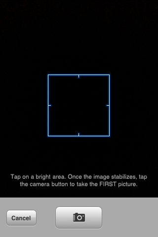
Once the user takes the first picture, similar instructions tell the user to tap on a dark area and take the second picture. The user then comes to a screen similar to this one:

The screenshot above is actually what the user sees when merging photos from the library. When taking pictures, the user continues to see the camera preview in the top section of the screen instead of the photo chooser as seen here. Once you have the two photos to be merged showing in the bottom section, press the Merge button to have TrueHDR align and merge the images.


There you have it! Simple, easy to use, and effective. There are a few so-called HDR apps in the app store which do nothing more than apply a saturation boost to a single photo. The only other app at the time of this writing that does true HDR is Pro HDR. I intend to give that a whirl soon since it is the same price as TrueHDR but looks like it gives the user more control over the results. I will post a brief writeup about the app once I have purchased and used it.
New Year's resolution
One thing I would like to do is get back to participating in the photo club field trips. Sure, a lot of them in the past have started before the crack of dawn in order to catch the good light (I'm NOT a morning person) but it has been worth the sacrifice. The trips present stimulating opportunities and challenges. Take the zoo trips for example. I love animals but I don't particularly enjoy wildlife photography (not that animals in a zoo are considered wildlife in the photographic world, but you get the idea). The trips present the challenge of finding interesting shots that don't necessarily involve animals. The zoo is a haystack and my challenge is to find a few needles. We had a Downtown Houston field trip a couple years ago which netted a nice shot of a fountain and one of a parking garage, among many others. My outings with the Houston Leica Fellowship have been enjoyable and productive as well, and my association with that group provided the opportunity to go on a 2005 photographic journey through China led by renowned photographer Dazhen Wu (吳大軫). That trip was truly a life-changing experience.
I would like to get back to doing more personal work and less work for hire. Sure, it's nice to make money, but personal work is, by its nature, more enjoyable. It can be stress-reducing and therapeutic. It also helps keep the creativity flowing.
I want to refine my skill as a digital printer so I can get what I see on my monitor to appear more faithfully on paper. I mentioned challenges above — printing can be very challenging too. Inkjet printing of black and white images is particularly difficult to do well. This might come as a surprise to some people but for me, printing black and white well is harder than color printing even considering all the color management issues that come with color printing.
I've spent 417 words talking about my resolution without directly saying what it is. In 2010, I resolve to make more photographs. I'm talking personal photos, work I do for my own enjoyment instead of for a cheque. I'm curious what other photographers are planning for the coming year so please leave a comment to tell us about your resolution.
All I wanna do is zooma zoom-zoom-zoom...
With the miniaturization of electromechanical components becoming so advanced, how long will it be before Apple gives the iPhone optical zoom? What would they call it, the iPhone 3G Z? Of course the intuitive way to control the feature would be the same multi-touch pinch maneuver that we’re already accustomed to using for zooming photos, maps, and web content in and out. Hey Apple, if you use my idea then all I want is an appropriate amount of Apple stock and a free replacement of my current iPhone with the one that incorporates these features, ok? Really. Call me.
You can watch the probably NSFW music video here if you are so inclined.
Professional development, part trois (a.k.a. "That Screen")
If you are reading this blog then the chances are good that you already know about all the podcasts mentioned above. You are probably already subscribed to most (or all) of them. Maybe you've even been enjoying them on the road with a 5.5G iPod for quite a while. As someone who made the jump to iPhone from the 4G iPod which couldn't even display still pictures, I have not had the luxury until now of watching video while out and about. However, the iPhone has two key advantages over the 5.5G iPod that would have had me upgrade anyway: only having to carry one device, and that screen! Oh, and did I mention the screen? It's considerably larger than the iPod screen in both pixel dimensions and physical dimensions. Granted, an 8GB iPhone only holds one tenth the data that an 80GB iPod can hold, but that's a trade-off I'm willing to make to have video-watching capability always with me at the ready and to be able to view it on that screen.
Great for abstracts
Camera performance

Slow "shutter" speed
Slow "shutter" speed
even with reasonable light
Marginal low-light performance
(poor contrast and lots of noise)Getting good color in Photos
Getting back to iPhoto... since I don't use it (or at least didn't until I started preparing for iPhone) I had forgotten that I turned off the "Copy files to iPhoto Library folder when adding to library" preference. In my iPhone preparations I was a dragging-and-dropping fiend, pulling in photos from some of my external drives as well as my local drive. Last night was the first time I synced without those drives mounted. When I saw iTunes' status bar say "Deleting photos..." I started to worry. Why was it deleting photos from iPhone?
During my troubleshooting, I discovered that the files iTunes had deleted were all TIFFs. I naturally assumed that was the problem and used Photoshop to create JPEG versions -- I also took that opportunity to size the photos to fit iPhone's screen dimensions and apply size-appropriate sharpening. I synced iPhone and what do you know? The photos were back. Only they looked washed-out compared to how they looked on the iPhone before. The colors were less saturated and contrast was lower, as if they didn't get converted from Adobe RGB to sRGB. Of course I realize that sRGB has a smaller gamut than Adobe RGB, but the images looked the same on my laptop screen after the color space conversion. After saving as JPEG and then opening the JPEGs in Photoshop again, they still looked almost identical to their Adobe RGB brethren with only very slightly less saturation. In iPhoto and on iPhone, however, they showed a marked difference. I tried saving the JPEGs with and without embedded profiles, but it didn't matter.
So the moral of the story is that if you have richly saturated photos that you want to display on your iPhone in all their glory, save them as single-layer TIFFs.

